 |
To focus on Castle Game Engine 7.0 release, I want to finish some important editor features.
-
Press F1 to open a WWW browser with the API reference of the selected property (when object inspector is focused) or at least selected component (in designer mode).
It jumps to proper location in the engine API reference or (in case of standard property like
TComponent.Name) to FPC reference. -
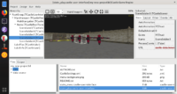
I started working on editor “gizmos” to visually transform a
TCastleTransforminstance. This is my biggest feature missing from CGE editor before release.You can now select the
TCastleTransforminstance if you first select a viewport, and then go into “Transform Select” mode. A bounding box of the selected object, as well as object under the mouse cursor, is shown. As part of finishing gizmos, this will be improved more (I think we can make the “Transform Select” mode possible without first selecting viewport, and I want to visualize the box+center in a more universal way, to be always visible). -
Small improvements to “Recent Projects” list: Detect projects on “recent” list with missing files, ask whether to remove them from list on opening, also update projects’ order properly.
-
If you’re on Linux (or FreeBSD) and want to have a nice menu entry for CGE and view3dscene, see here. Of course when installing from package (CGE is already in Debian, but for now an old version before editor) this would be automatically set up.
Nice features, I think also UI can be improve (like Godot or Unity).
I did some changes on Editor for personal usage but this is unstable.
1- Icon support
2- Symmetrical panels and tabs
3- Windows dark theme
4- Auto Save on Deactive Options ( auto saving on switching between editor and lazarus )
5- Favorites tab (only listing .castle-user-interface files)
6- Find in Hierarchy and Fast Add button
Maybe some of this features can be added next official version
Hi!
Thanks for the good words, and cool screenshots!
Yes, I’d like to have some of these features.
If you’d like to contribute, pull requests are most welcome (with each feature in separate PR, to easier review). In any case, this is a great inspiration how the editor could look like, it looks way better than what we have now – thank you! I’ll keep looking at this to incorporate
Thank you i am glad, this features small but useful. I can’t contribute for now cause my works unstable, dark theme only working windows, most of icons missing only for black theme and other things too.
This screenshots like concept art for inspiration and showing CGE Editor potential.
I will try contribute for small things next time, thank you