 |
OK, not really a zillion 🙂 But I seriously addressed a few important issues with editor usability and I think these improvements have a big impact. Some important things are now more intuitive for beginners, some behave better for larger projects.
As usual, I encourage you to try the improvements immediately by downloading the latest engine version. And please support us on Patreon because we really rely on it.
Improvements:
-
The default editor tool now allows to select and modify both UI (instances of
TCastleUserInterface) and 3D / 2D game stfuf (instances ofTCastleTransform).In a broader context, the tools to operate on UI and transformations have been merged. There’s no longer a special “Modify UI” tool (that didn’t work on transforms). The tools “Translate” / “Rotate” / “Scale” remain, but now they work on both transforms (allowing to translate / rotate / scale them) or UI (in which case you can always translate + resize it).
This makes using editor much simpler. You will no longer need to switch modes so often.
Note: To operate on something (UI or transform) without changing the currently selected object, remember you can drag with Shift.
-
Hierarchy (left panel) is updated smarter, without rebuilding it from scratch. This makes adding / removing components experience much better: it will not reset the expanded / collapsed state of your components, it will not reset the scroll position within the hierarchy list.
-
We now show a label alongside selected UI components of size zero, to make them actually visible in the editor.
This addresses a common situation with
TCastleVerticalGroupandTCastleHorizontalGroup— they have by default size zero (since they have no children initially, and haveAutoSize = trueby default). While the zero size makes sense for them, but to the user it was confusing what is going on — you added a group, but nothing was visible?Now, newly added
TCastleVerticalGroupandTCastleHorizontalGroup, while it still has size zero, is clearly visible.This also fixes analogous issue with
TCastleImageControl, that has size zero by default, becauseURLof the image is not set initially, andStretch = false(so control size matches image size, and there’s no image). -
If you cannot resize or move a component, sometimes it makes sense to move or resize the parent. This in particular applies to moving/resizing a UI with
TCastleUserInterface.FullSizeor moving a UI underTCastleVerticalGroup/TCastleHorizontalGroup. Previously these operations were blocked, now they affect the parent. -
If you cannot resize a component because it has property like
TCastleButton.AutoSize, now we display this using a tooltip (when you try to resize it). So it should be more obvious that you can turn off properties likeTCastleButton.AutoSizeon many components to make them resizeable. -
Important API cleanup: We now have
TCastleUserInterface.Translationproperty, consistent withTCastleTransform.Translation.The previous
TCastleUserInterface.AnchorDeltais a deprecated alias forTranslation. TheHorizontalAnchorDelta,VerticalAnchorDelta,Left,Bottomare deprecated.This change is fully backward-compatible. We deprecate some things, but they all continue to work as before.
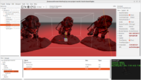
Screenshot for this news post continues our tradition — “if you don’t have a perfect screenshot to illustrate your features, just find a pretty model on Sketchfab and show it rendered using CGE” 🙂 In this case, I searched for “smooth” and found this beautiful monster: Gears of War – Grinder by nataliedesign.
Start the discussion at Castle Game Engine Forum