 |
 |
 |
 |
Sorry for the long news title and even longer news post 🙂 This is a very important bugfix and at the same time it couldn’t (reasonably) have been done in 100% backward-compatible way. We tried to explain everything below. If in doubt how to upgrade your projects (in case things will look different), don’t hesitate to contact us by forum, Discord or any other means, we’ll help! The core of the change happened in this commit on August 1st (2024), well before 7.0-alpha.3 release so it affects everyone who upgrades to engine after that date with a project created before that date.
What was fixed? A few properties of the TCastlePointLight, TCastleSpotLight and TCastleDirectionalLight had their default values applied incorrectly. That is, the default values were correct, but their effect was wrong. In particular, TCastlePointLight.Attenuation and TCastleSpotLight.Attenuation were not applied correctly.
The most visible consequence of the bug (now fixed): The default attenuation of positional lights (TCastlePointLight and TCastleSpotLight components), equal to 0 0 1 (realistic intensity falloff, following the inverse square law) was not applied. In effect, default lights didn’t have any “attenuation”, which means they were bright even on objects far away from the light position (very unrealistic). The behavior was equivalent to attenuation 0 0 0, although the property value was 0 0 1.
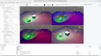
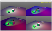
In short, what you may observe after the fix if you open a project created in older engine: Some of lights you have set up in your viewport (using TCastlePointLight and TCastleSpotLight) may look different, in effect your world may look darker.
Why the change is good? New lights behave in much more realistic way. It was obvious to me after doing the fix how many of our previous examples have been unrealistically bright, different than how other 3D software (like Blender or other game engines) treats positional light sources. Previous light look was incorrect, not following the attenuation value (0 0 1 behaved like 0 0 0) and not realistic (no light falloff is not realistic). The new behavior is correct, and much prettier by default.
Default intensity also changes: To account for the fact that new positional lights (TCastlePointLight and TCastleSpotLight) are much quicker fading to darkness, we also changed their default Intensity (TCastlePointLight.Intensity and TCastleSpotLight.Intensity) from 1 to 100. Previous default, 1, was too small to be useful with the new attenuation.
We also adjusted the default light setup when adding a new “Viewport (3D)” component in the editor. To make it work reasonably out of the box, useful for demos etc.
We are now more consistent with other applications. Specifically:
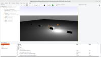
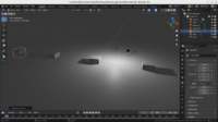
- Now, after the fixes, our default point light is quite like Blender’s default light. Comparing screenshots, it is obvious now they both have ~inverse square falloff, out of the box. Testing on a plane with boxes setup at 10 units around center — lighting works similar, see the screenshot in this post. This is great.
-
Unity by default adds a directional light to the a new 3D scene, which naturally behaves differently than the point light (attenuation doesn’t matter, and much smaller intensity is reasonable). But if you add point light in Unity, with intensity 100, at height = 3, it behaves similarly to us — again, this is good consistency.
-
We are also consistent with glTF lights, with inverse square falloff (which was why I chosen attenuation = 0 0 1 as a default long time ago). See glTF/extensions/2.0/Khronos/KHR_lights_punctual/README.md, “Within the range of the light, attenuation should follow the inverse square law as closely as possible”.
What to do to in your old projects to adjust to the new lighting?
This fix is necessarily breaking compatibility in some cases. If you relied on the fact that your positional lights by default did not have attenuation (because effectively attenuation 0 0 1 was treated like 0 0 0) then once you upgrade to the new engine version, you will notice that everything is darker.
-
The quickest, painless solution is to just set the
Attenuationof the positional (point, spot) lights from0 0 1to0 0 0. This disables attenuation. You can also readjust theIntensityfrom100back to1(without any attenuation, much smaller intensity values are reasonable).This is the simplest way to get back exactly the same behavior as before.
-
The alternative approach, that will take more time, but is also more recommended, is to keep the realistic attenuation (0 0 1) and adjust your light setup. We did this in all CGE examples.
You can use more lights. You can add an additional directional light to make everything at least slightly brighter. It may even make sense to add 2 directional lights, with different directions in X and Z (but similar in Y) to simulate the daylight best. There’s no straightforward advice here, sorry — you have to experiment and decide what you want to be bright / dark, and how to achieve it using realistic lighting.
You can also bump intensity of existing point/spot lights. It was automatically upgraded from 1 to 100, but other values (like 2) have not been adjusted. Consider increasing the intensity yourself.
Note: We looked into adding some hack to preserve the look of older setups, to keep compatibility. But it was causing more pain and complications. The problem of the old approach was not “wrong default property value” but “default property value was not properly applied”. We tried two “hacks for compatibility”, to make old lights look like they did, but they seemed both dangerous (making code really ugly to maintain) and confusing to users (since they had to essentially “activate a buggy behavior” under certain conditions). So, we decided to avoid hacks, and break compatibility, to just render stuff 100% correctly from now on.
What does not change, to be clear:
-
If you have customized the
attenuationof your lights previously, even very slightly (e.g. to0 0 1.1) then it was applied OK. The bug only affected you if you left attenuation untouched, exact0 0 1. -
Nothing changes in the way how attenuation equation matters (see X3D spec about how attenuation should be applied).
-
The change doesn’t concern X3D nodes for lights (like
TPointLightNode) and so nothing changes for lights you set up e.g. in Blender and exported to glTF or X3D. These look the same as before, and everything was and is correct in their case. -
The default
TCastleDirectionalLight.Intensitydidn’t change, it is still 1.
Things are better 🙂I (Michalis) feared this change, admittedly — as I realize this is a significant compatibility break. But after testing, and adjusting all our examples to follow it (honor attenuation = 0 0 1, physical)… everything looks so much better.
I hope you enjoy new correct and realistic lighting out-of-the-box!
Start the discussion at Castle Game Engine Forum