 |
 |
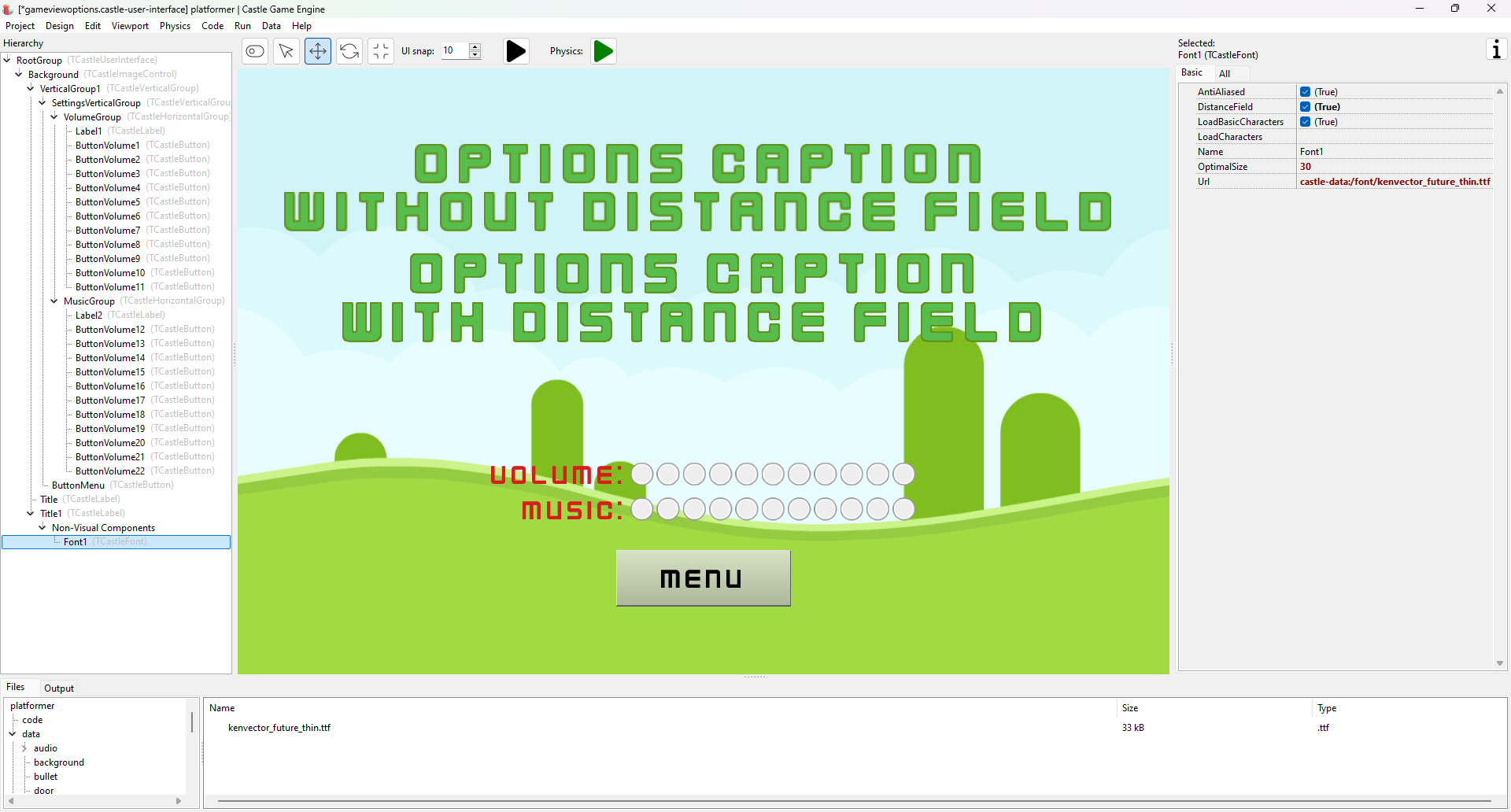
A new option at TCastleFont is available that activates distance field font rendering. Using it is trivial: just set up TCastleLabel with custom font in TCastleFont, following the manual about text and fonts. Then toggle TCastleFont.DistanceField checkbox to true.
This is an alternative technique for rendering fonts which results in font having better quality if you “upscale” it, that is: render large font size (e.g. because TCastleLabel.FontSize is large, like 100.0) but the underlying font texture is small (that is: TCastleFont.OptimalSize is smaller, like 30.0).
The font rendered using distance field fonts always remains “crisp” on the edges.
The technique, at least in our current implementation, has some drawbacks — see TCastleFont.DistanceField API documentation. Never the less, it definitely results in a more crisp text look in many practical cases.
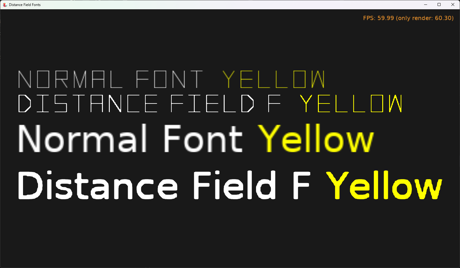
An extreme examples of it are available in (maybe even a bit too extreme, it shows actually some issues) is the new example: examples/fonts/distance_field_fonts.
This feature has been implemented largely by the late Eugene Loza. We miss you.
Start the discussion at Castle Game Engine Forum