Last week, I got my PineTab2 tablet, made by the PINE64 community. In a way, it’s an early Christmas gift I bought for myself 🙂 It’s a tablet running Linux on 64-bit Arm. My hope was to have something that can be a tablet (light device, can do tasks for which touchscreen input is comfortable enough, like read things and watch movies) but also can be a laptop (do e.g. coding, as it features a fully-functional Linux and a keyboard with touchpad). It took some tinkering, but I have to say my hope was fulfilled and I love it 🙂
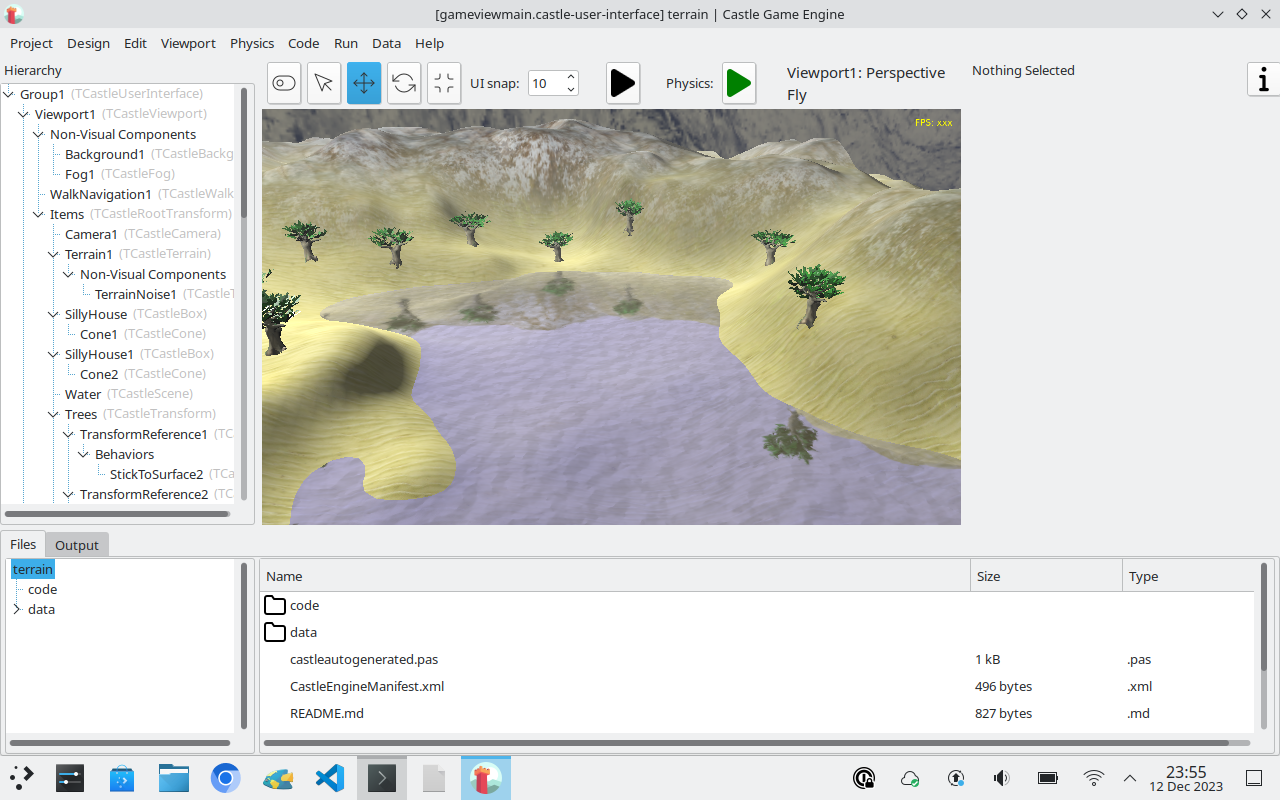
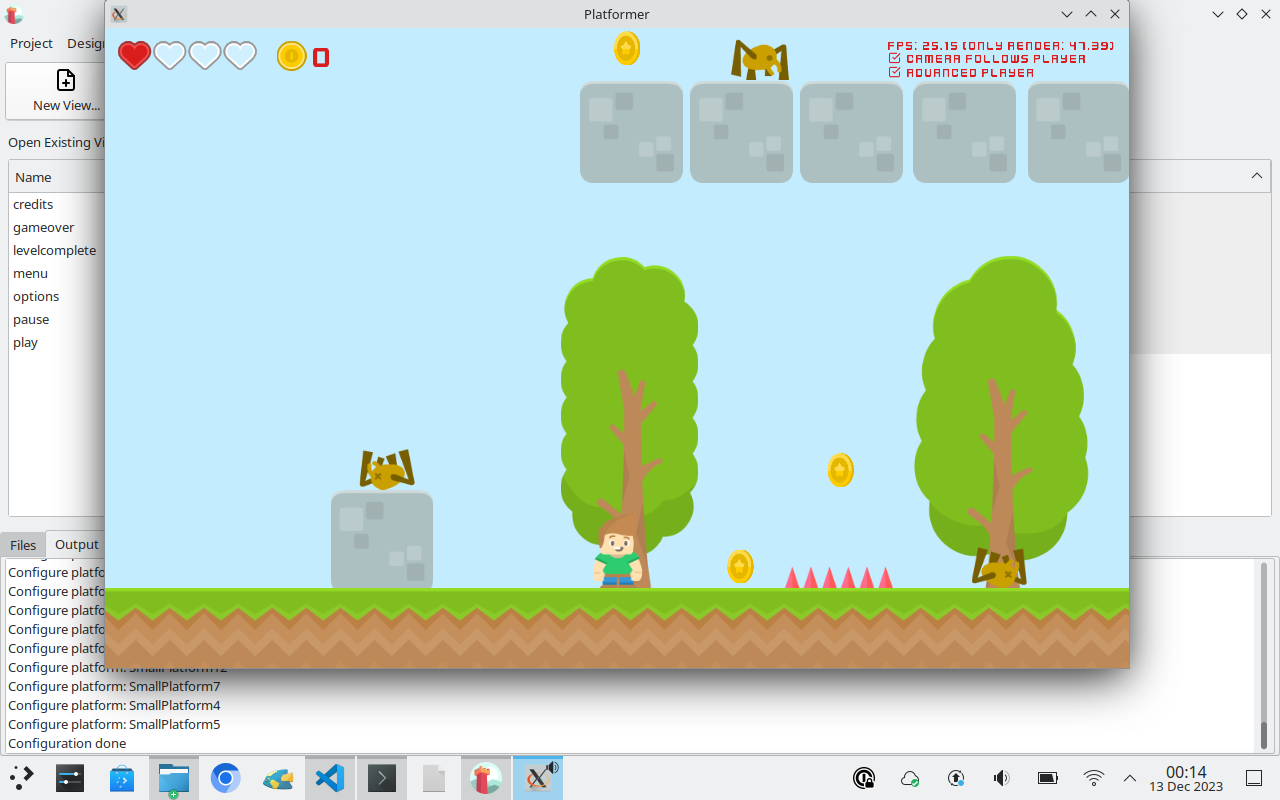
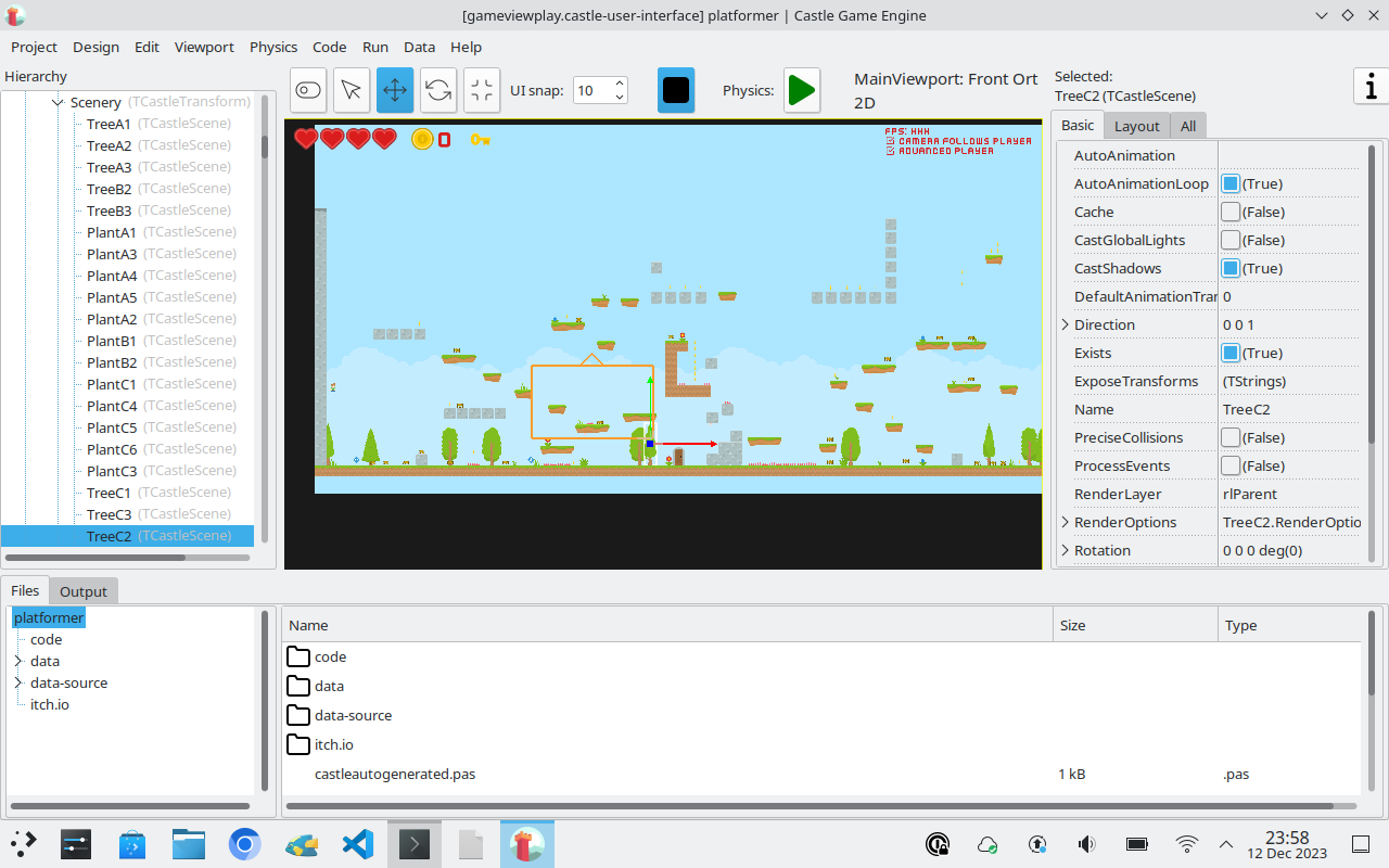
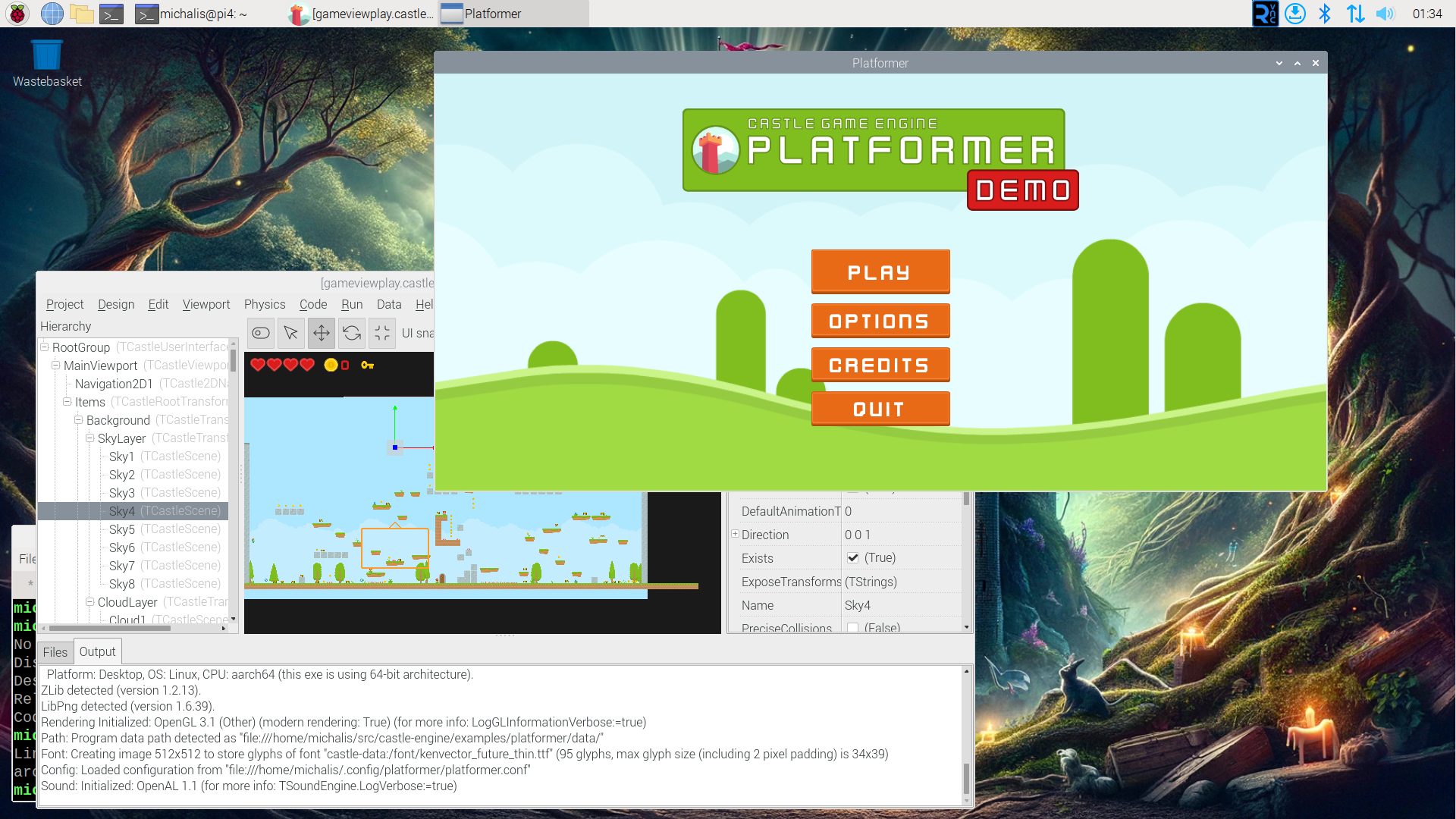
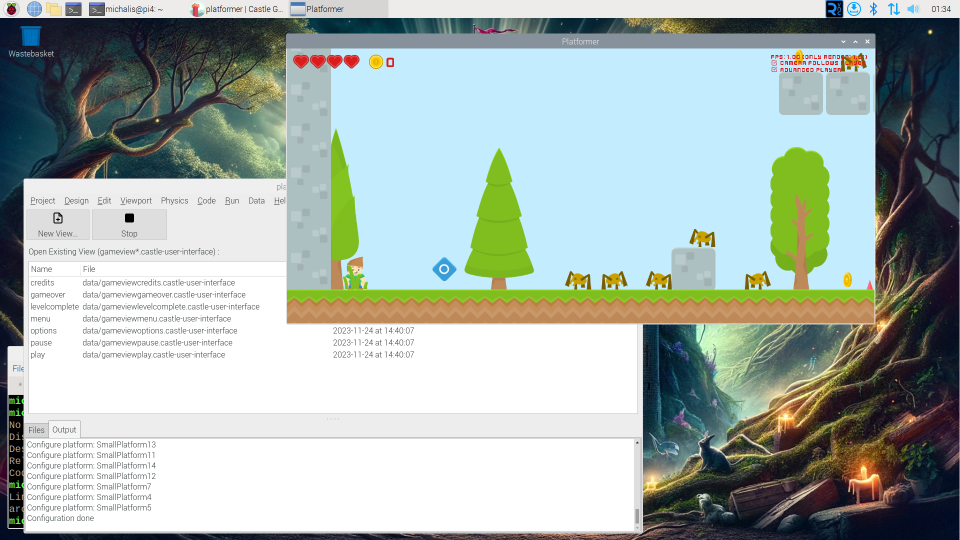
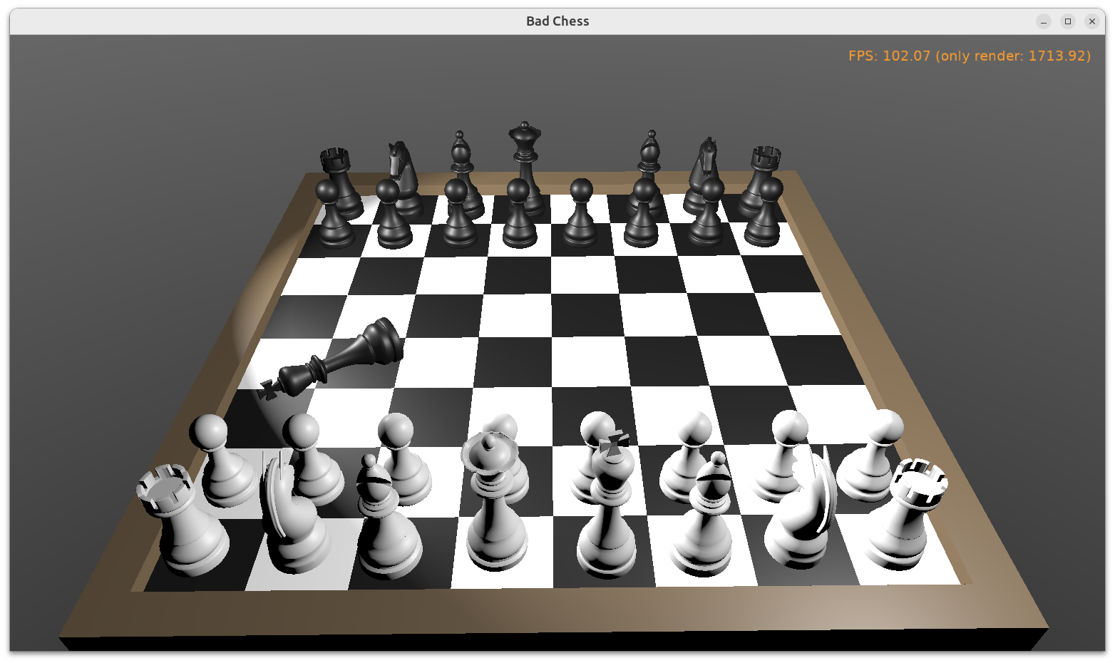
It’s still a low-end device, by which I mean that it’s not very fast and when I have a choice — working on a regular modern PC / laptop is just faster. But it’s also not terribly slow. It is much more powerful than e.g. a Raspberry Pi 4 (e.g. examples/platformer runs on PineTab2 with ~30 FPS, which is playable; on Raspberry Pi 4, I could run it, but it wasn’t really playable). The device is fast enough to even use KDE Plasma by default (Though I’m a GNOME guy, I’m bound to install there familiar GNOME 3 or XFCE at some point; but for now I enjoy KDE, it’s an interesting change for me).
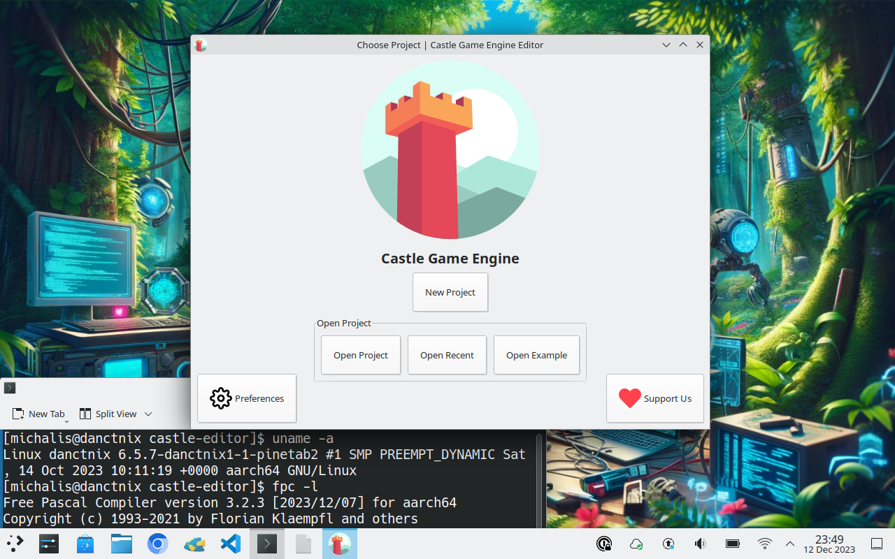
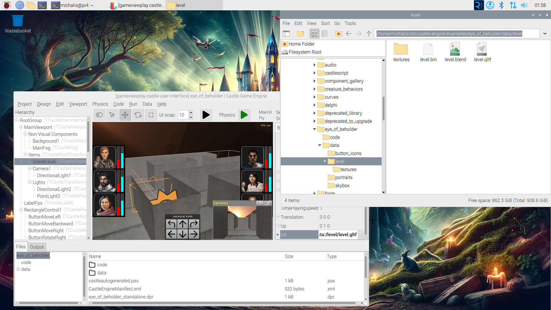
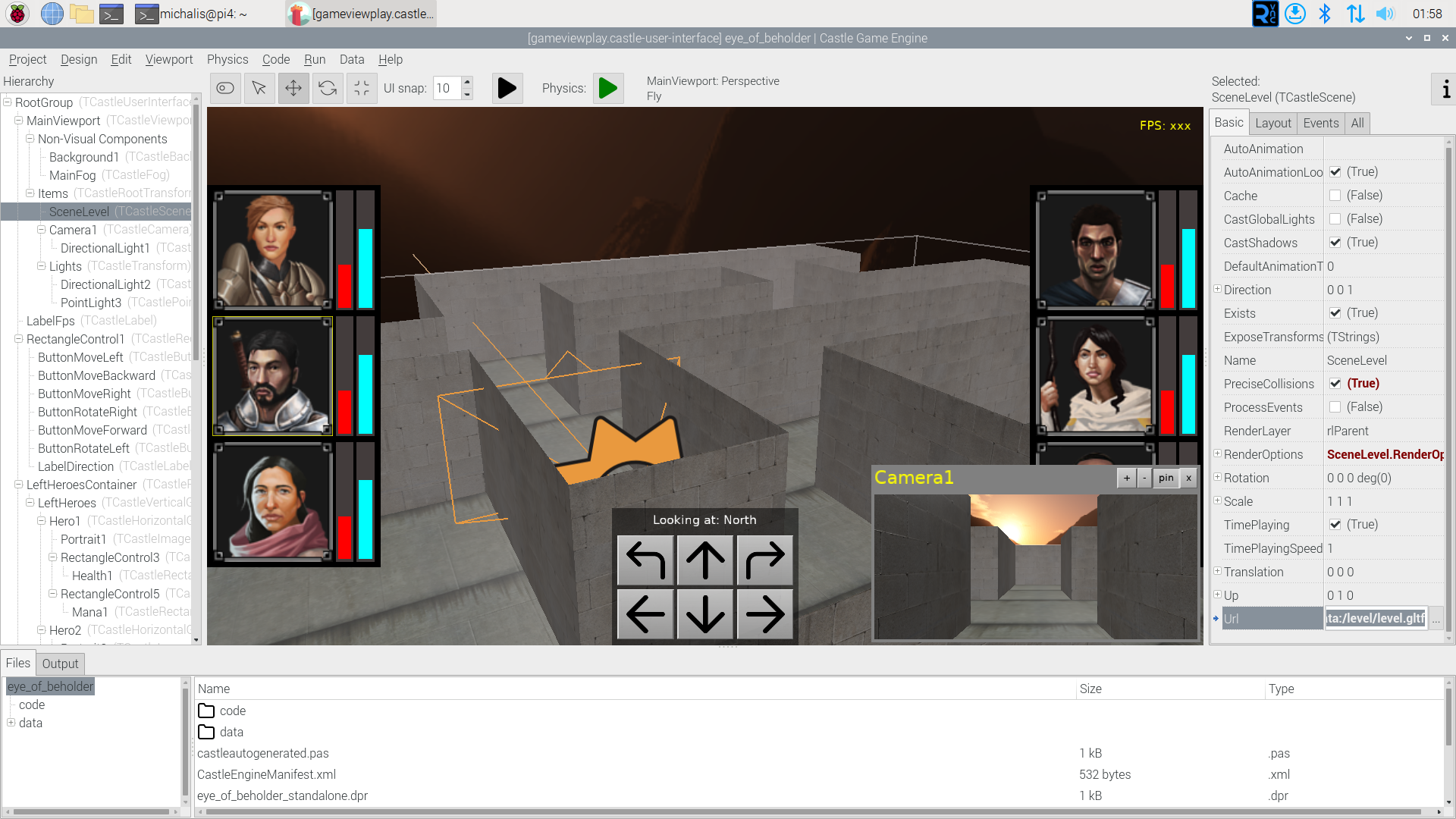
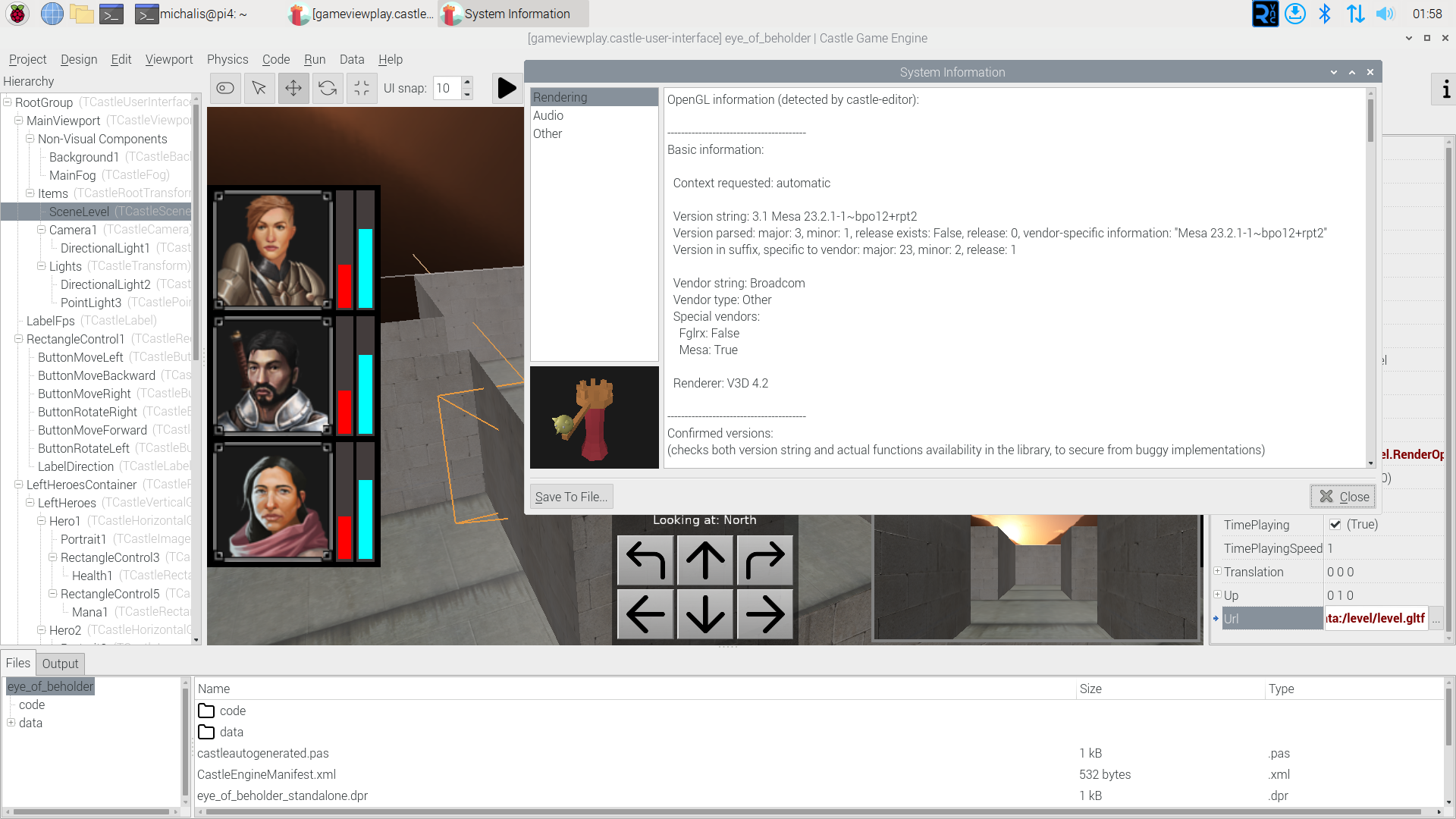
You can install there FPC, Lazarus, VS Code, and finally our Castle Game Engine and have fun making games. The default OS on PineTab2 is DanctNIX, which is Arch Linux ARM, and in practice it features most of software you would find on a regular Arch Linux, both from official packages and AUR.
Technically, it is just Linux on a 64-bit Arm CPU (known also as Aarch64).
You can guess where this is leading: The official Linux/Aarch64 downloads of Castle Game Engine “just work” on PineTab2. Enjoy!
There are no special instructions, just download, unzip and run bin/castle-editor inside, as on other platforms. Remember to also install FPC (Free Pascal Compiler), see below
FPC on PineTab2
While you can install FPC from the packages (sudo pacman -S fpc), you may experience linking problems with FPC 3.2.2. They result in errors with messages like undefined reference to__libc_csu_init’`.
When that happens, my advise is to install FPC 3.2.3 (from the fixes_3_2 FPC branch). I am testing now on FPC 3.2.3 + Lazarus IDE from recent main branch. I used my install_fpc_lazarus script for easy setup.
Castle Game Engine in AUR
About CGE package in AUR: While it should work in the future, first the FPC built into DanctNIX has to be upgraded (see above — FPC 3.2.2 will have problems at linking). Then we should update the castle-engine-git package to just add aarch64 architecture and it will rock, allowing you to install CGE on it by just yay -S castle-engine-git.
Editor binaries: GTK2 or Qt5
The CGE editor on Lonux comes with 2 binaries since some time: castle-editor (GTK 2) and castle-editor-qt5 (Qt5). To run the latter, you have to install qt5pas (sudo pacman -S qt5pas) but it does have occasional crashes, looks like some LCL Qt5 widgetset problems. I advise using castle-editor for now.
PinePhone, PineBook Pro
In theory, this support should extend as well to other PINE64 products using Arm64, like Pinebook Pro and PinePhone. They all “just run Linux on Arm64” so in principle should work.
I’m pretty confident that it will work on Pinebook Pro without any issues. I would assume it would be just an upgraded experience compared to PineTab2 in terms of performance, but without touchscreen.
I’m super-curious about PinePhone 🙂 If anyone has PinePhone, and wants to test can we install FPC and CGE there, let me know. I can help if you want, e.g. we can meet online and test it together.
Before you buy PineTab2
In case this post encourages you to actually buy PineTab2 tablet, please take into consideration:
-
I am enthusiastic about this tablet, and I’m also a Linux fanboy 🙂 I actually enjoyed testing 3 different OSes on this (DanctNIX, Ubuntu Touch, Rhino Linux) to see what works best. I enjoyed testing browsers to see what has best support for the touch screen, performance, and can play DRM content. I enjoyed playing with WiFi (while the laptop has a WiFi card, DanctNIX doesn’t feature a working WiFi driver, and the simplest recommendation is to use a WiFi dongle; Ubuntu Touch has a working WiFi driver, but comes with different issues around touchpad).
-
Make your own decision if you will enjoy above tinkering too 🙂
-
See PineTab2 wiki and reviews like Pine64 PineTab 2 unboxing and review by Ivon Huang, After 3 months of daily-driving tPineTab 2, ARM Linux tablet, I love but also hate it.
-
If you want a fast and fully-functional tablet that “just works” then a modern Android tablet or iPad may suit you better. (Though PineTab2 supports Waydroid so you can run Android tabs, but with performance hit.)
And if you want a fully-functional laptop that “just works”, than a regular laptop may be better 🙂 PineTab2 wasn’t even supposed to be a laptop (for this, see Pinebook Pro). I just decided to test can it fulfill the role of a laptop, for some work, for me.


