User Interface
1. Introduction
Castle Game Engine features a number of user interface (2D) controls. You can build a complete user interface in the CGE editor, you can also build and modify the whole UI using our Pascal API. Our UI controls have parents, anchoring, UI scaling. If you set the anchors right, our UI will "just work" at various screen resolutions, aspect ratios and platforms, and can seamlessly adjust to any desktop or mobile screen.
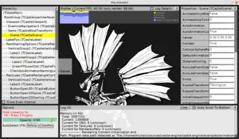
As an example, take a look at this design that is used for our inspector (see the Inspector invoked by F8 movie). Coupled with the right code, this design implements a non-trivial UI with toggable panels, scrollable list box, minimal scrollable object inspector, custom-drawn profiler and more.
2. Usage
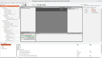
The basic usage of UI controls inside the CGE editor is explained in the chapter Designing user interface and handling events (press, update) within the view. It shows how to use TCastleImageControl — but the workflow shown there applies to all other UI controls too. It comes down to:
-
Using "Add User Interface" menu item in the CGE editor to choose a component. It will be added to the view. It’s usually most comfortable to use "Add User Interface" by right-clicking on the parent component in the editor hierarchy.
-
After adding, you want to adjust basic component properties, like
Name, position and size. -
To access the component from code, you need to declare it in the
publishedsection of your view, likeMyLabel: TCastleLabel. The fieldMyLabelwill then be automatically initialized when view starts. You can modify this component from code however you want, e.g. doMyLabel.Caption := 'something'.
3. Available user interface controls
In general, all the descendants of TCastleUserInterface defined in the engine are UI controls. This page lists the most important ones.
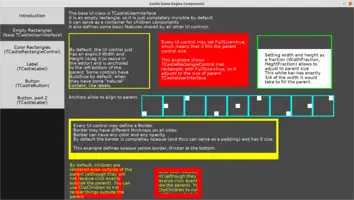
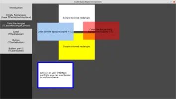
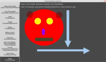
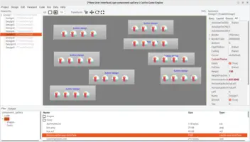
See the component_gallery demo for a showcase of our most important components. You can run that example and explore its UI designs in CGE editor.
3.1. Empty Rectangle (base TCastleUserInterface)
TCastleUserInterface is a base UI class. It is an ancestor of all other UI classes, and as such implements common features like anchors and borders. It can be used directly too — will serve as a good parent, to organize a number of children controls or surround them with a visual frame.
3.2. Color Rectangles
TCastleRectangleControl is a rectangle filled with simple RGBA color. Its most important property is TCastleRectangleControl.Color.
3.3. Label
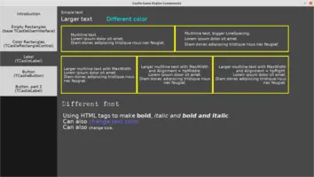
TCastleLabel is the simplest way to display text in our engine. Its most important property is TCastleLabel.Caption (or, if you want access the multi-line string list, TCastleLabel.Text).
3.4. Image
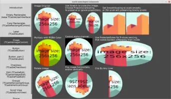
TCastleImageControl displays an image. It can be scaled, preserving the aspect ratio or ignoring the aspect ratio, if needed. Its most important property is TCastleImageControl.Url.
|
Note
|
Drag-and-drop image from the "Files" panel (at the bottom) over a UI design to create a TCastleImageControl component easily.
|
3.5. Button
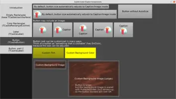
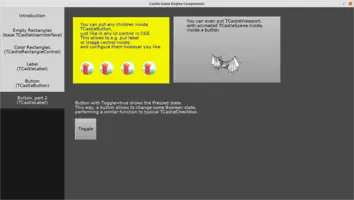
TCastleButton is a clickable UI element. The look can be incredibly customized to match the style of your game. Its most important properties are TCastleButton.Caption and (assign here your event, in code) TCastleButton.OnClick.
3.6. Checkbox
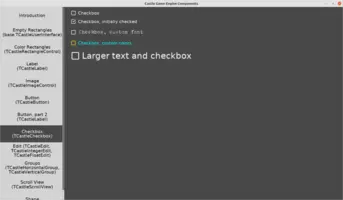
TCastleCheckbox allows user to check/uncheck a checkbox, to make a Boolean choice. Its most important properties are TCastleCheckbox.Caption and (assign here your event, in code) TCastleCheckbox.Checked.
3.7. Edit (text, integer, float)
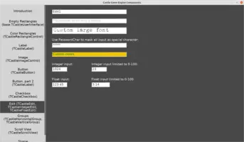
TCastleEdit allows to edit a single-line text. Its most important property is TCastleEdit.Text.
It has simple descendants TCastleIntegerEdit and TCastleFloatEdit to edit numbers. Their most important properties are, respectively, TCastleIntegerEdit.Value and TCastleFloatEdit.Value.
3.8. Group (horizontal, vertical)
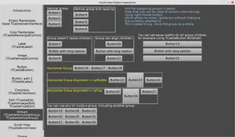
TCastleHorizontalGroup and TCastleVerticalGroup automatically layout their controls in a horizontal and vertical fashion.
3.9. Scroll view
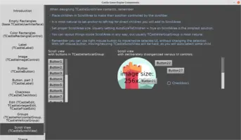
TCastleScrollView allows to scroll a large (tall) area with a vertical scrollbar. Its most important property is TCastleScrollView.ScrollArea, this is where you should add children that should scroll.
3.11. Design (refer to another UI design)
TCastleDesign inserts a UI design from another xxx.castle-user-interface file. This allows to reuse the same UI design multiple times. Editing the original xxx.castle-user-interface will update all instances where this design is used.
|
Note
|
Drag-and-drop xxx.castle-user-interface from the "Files" panel (at the bottom) over a UI design to create a TCastleDesign component easily.
|
3.12. Mask
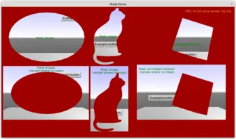
TCastleMask allows to define a mask (using an arbitrary UI control) and use this mask to limit rendering the children.
The mask may be any UI control (or a composition of it). The colors do not matter, only which pixels are drawn by the mask. E.g. you can define a mask using
-
An image (
TCastleImageControl) with alpha channel. Be sure to setTCastleImageControl.AlphaChanneltoacTest. -
A viewport (
TCastleViewport), maybe even with something animated and/or 3D. Be sure to setTCastleViewport.Transparenttotrue. -
A shape (like
TCastleRectangleControl,TCastleShape).
The masked children, in turn, can also be any UI control. So you can filter rendering of anything, even if it’s interactive (like a button) or 3D (like a viewport).
TCastleMask.MaskRendering determines if the children are rendered where the mask is visible or (on the contrary) where the mask is not visible.
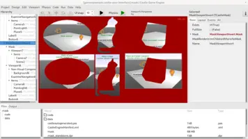
See the example examples/user_interface/mask for demonstration.
To improve this documentation just edit this page and create a pull request to cge-www repository.
