Website facelift
 |
 |
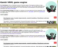
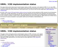
As you can see, this week brings many improvements to our website. I hope it's now easier to navigate, and things look a little better :)
We have a nice header, visible at the top of every page, with most important links / sections clearly emphasized. Among other things, this avoids the previous looong index page. And makes the important but previously too-easy-to-miss links "Forum" and "Engine" (for developers) more visible.
Some sections get a sidebar on the right for easier navigation. This is especially useful with X3D section, which has a huge number of useful content especially under Implementation status.
We also have "breadcrumbs" visible on pages deeper in the hierarchy, like Shaders implementation status. Together with header and sidebar they (hopefully) clearly show you where you are in the website.
New X3D page, an introduction to the whole VRML/X3D section, explains "What is VRML / X3D" in a short and friendly way. This will hopefully explain newcomers (to our engine, and/or X3D) why this 3D format is so great that I based my whole engine on it :)
- Our news are nicer now, with each news post displayed on a separate page (previous "one page with all the news" was getting awfully long to load). You get nice Newer / Older links and a sidebar to navigate among our news posts easily.